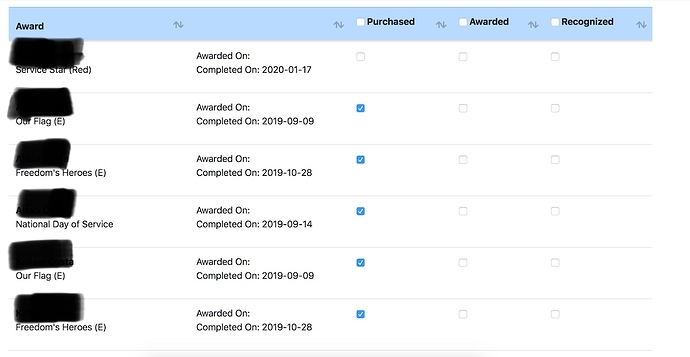
What I like about the current version of Present Awards is that it alternated lines of shading vs. white for each girl which makes it easier to look across the page and make sure you are on the same person. The Beta is just all white. Also, on the Beta site, the gaps between people had too much which space. It made for ALOT of scrolling down the page looking through the troop. And when I am going through 30 girls, I would like to see more on the page at a time.
Hopefully the screenshots below show what I’m talking about :-). This is the same amount of screen, but you can see Less than half the girls on the Beta site. Seems like ALOT of white space.
THX!!

